Showcase your data with a professional data dashboard
My mission is to produce beautiful data visualizations and dashboards that are smart, insightful, and intuitive. I also aim to collaborate on developing data visualization and interactive dashboard strategies to share datasets and research outcomes.
Whether it’s a simple web app or a complex one, I help you plan, design and deploy. My web apps are built using Shiny and can be hosted on a cloud server and made accessible to the public via a web link. The apps use the latest technologies and frameworks, ensuring that they are secure, and future-proof.
If you’re interested in learning more about my Shiny app development services, please don’t hesitate to get in touch. I offer a free consultation to discuss your project requirements and provide you with a quote. I’m passionate about creating web apps that make a difference, and I look forward to working with you to bring your vision to life.
Get in touchThe sample portfolio below includes a variety of web apps that I have built that cater to different industries and user needs.
Migrants of the World Dashboard
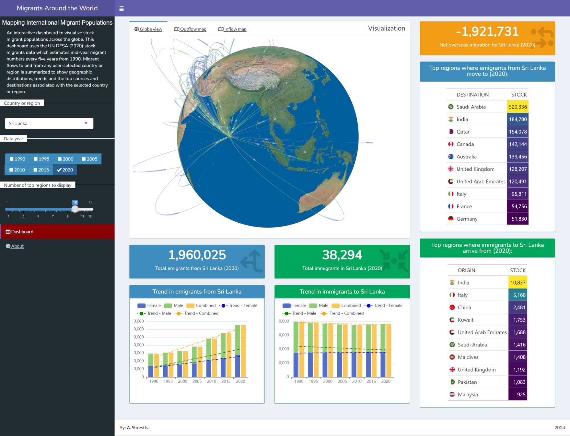
This dashboard is designed to explore and visualize stock migrants data from 1990 to 2020. Built using Shiny, this dashboard displays valuable insights into how a country or region is connected globally by receiving migrants and sending emigrants. This dashboard utilizes the UN DESA (2020) stock migrants data which estimates mid-year migrant numbers in each region every five years. Visualization of data is done through interactive maps, 3D globe, graphs and data tables.
Vulnerability dashboard
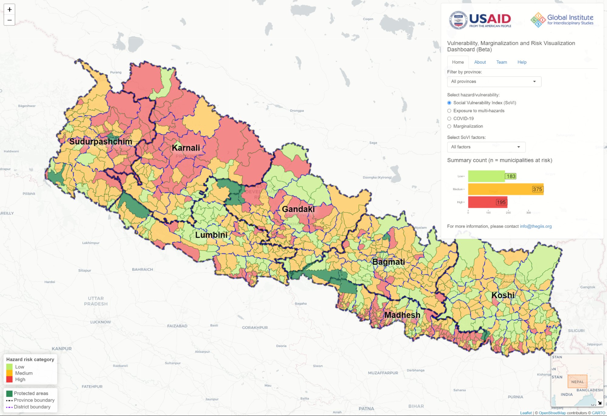
This data visualization portal provides information of social vulnerability, marginalization and exposure to multiple hazards including COVID-19 risk at the municipality level-the lowest administrative unit in Nepal. This dashboard is part of a research by the Global Institute for Interdisciplinary Studies, Nepal—a Kathmandu-based interdisciplinary research organization.
Cropping Calendar Visualization
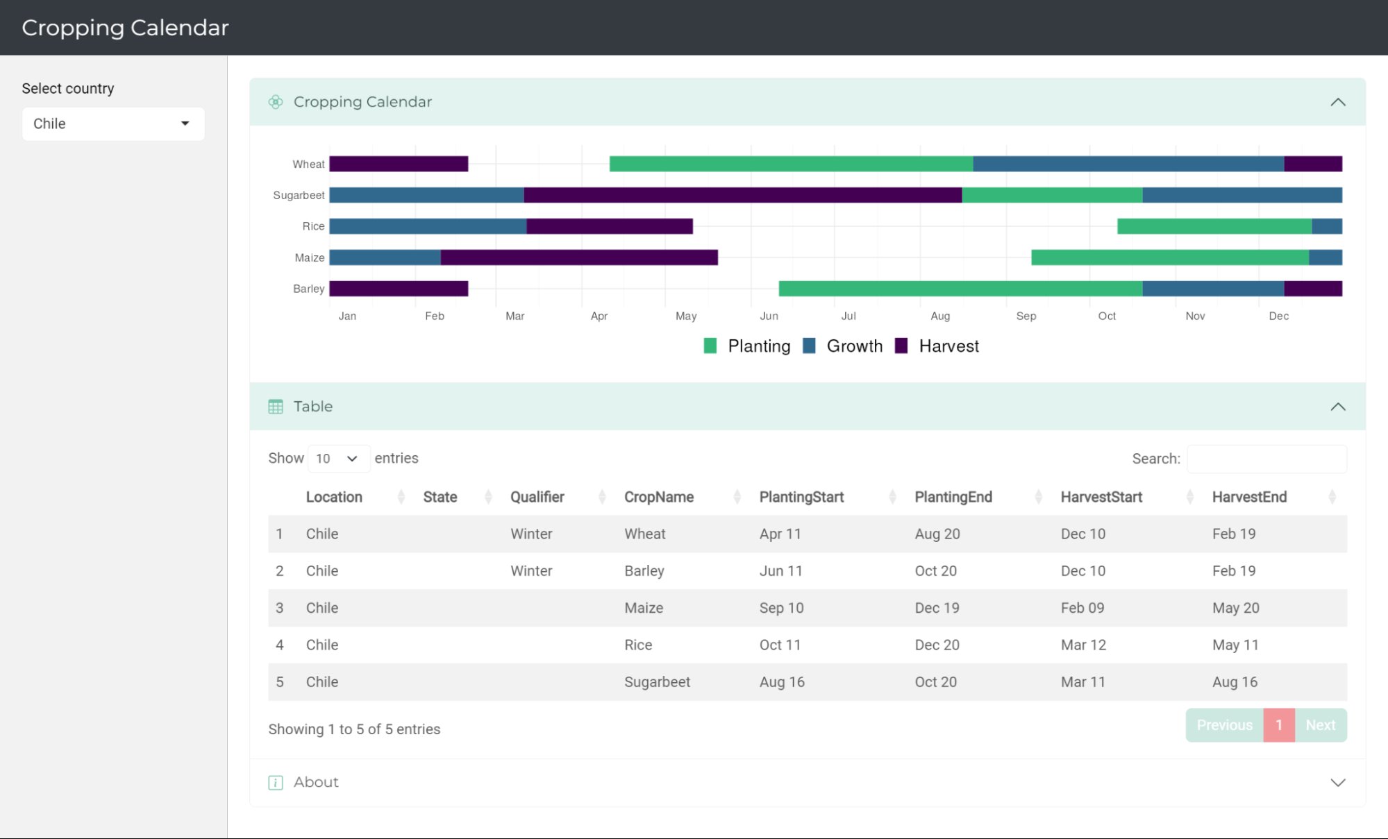
An app to visualize key dates for various crops organized by country and region. Once you make a selection of the region using drop-down menus, the calendar will be displayed. This app uses the crop calendar dataset from Sacks et al. (2010) and is built using Shiny.
Nepal Earthquake Dashboard
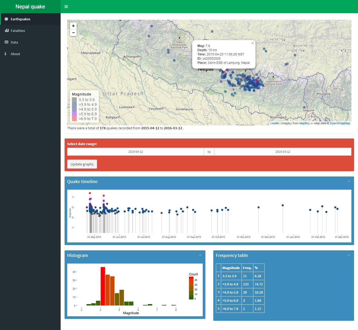
Explore the seismic events surrounding the April 2015 Nepal earthquake with this earthquake explorer dashboard. You can explore the locations of the quakes in an interactive map. Data on fatalities by district can also be explored in maps as well as graphs and tables. This app uses publicly available data and is built using Shiny.